Yield Curve Inversion

Every so often, we hear warnings from commentators on the “inverted yield curve” and its predictive power with respect to recessions. An explainer what a inverted yield curve is can be found here. If you’d rather listen to something, here is a great podcast from NPR on yield curve indicators
In addition, many articles and commentators think that, e.g., Yield curve inversion is viewed as a harbinger of recession. One can always doubt whether inversions are truly a harbinger of recessions, and use the attached parable on yield curve inversions.
In our case we will look at US data and use the FRED database to download historical yield curve rates, and plot the yield curves since 1999 to see when the yield curves flatten.
First, we download monthly rates for different durations.
# Get a list of FRED codes for US rates and US yield curve; choose monthly frequency
# to see, eg., the 3-month T-bill https://fred.stlouisfed.org/series/TB3MS
tickers <- c('TB3MS', # 3-month Treasury bill (or T-bill)
             'TB6MS', # 6-month
             'GS1',   # 1-year
             'GS2',   # 2-year, etc....
             'GS3',
             'GS5',
             'GS7',
             'GS10',
             'GS20',
             'GS30')  #.... all the way to the 30-year rate

# Turn  FRED codes to human readable variables
myvars <- c('3-Month Treasury Bill',
            '6-Month Treasury Bill',
            '1-Year Treasury Rate',
            '2-Year Treasury Rate',
            '3-Year Treasury Rate',
            '5-Year Treasury Rate',
            '7-Year Treasury Rate',
            '10-Year Treasury Rate',
            '20-Year Treasury Rate',
            '30-Year Treasury Rate')

maturity <- c('3m', '6m', '1y', '2y','3y','5y','7y','10y','20y','30y')

# by default R will sort these maturities alphabetically; but since we want
# to keep them in that exact order, we recast maturity as a factor
# or categorical variable, with the levels defined as we want
maturity <- factor(maturity, levels = maturity)

# Create a lookup dataset
mylookup<-data.frame(symbol=tickers,var=myvars, maturity=maturity)
# Take a look:
mylookup %>%
knitr::kable()| symbol | var | maturity |
|---|---|---|
| TB3MS | 3-Month Treasury Bill | 3m |
| TB6MS | 6-Month Treasury Bill | 6m |
| GS1 | 1-Year Treasury Rate | 1y |
| GS2 | 2-Year Treasury Rate | 2y |
| GS3 | 3-Year Treasury Rate | 3y |
| GS5 | 5-Year Treasury Rate | 5y |
| GS7 | 7-Year Treasury Rate | 7y |
| GS10 | 10-Year Treasury Rate | 10y |
| GS20 | 20-Year Treasury Rate | 20y |
| GS30 | 30-Year Treasury Rate | 30y |
df <- tickers %>% tidyquant::tq_get(get="economic.data",
                   from="1960-01-01")   # start from January 1960

glimpse(df)
## Rows: 4,169
## Columns: 3
## $ symbol <chr> "TB3MS", "TB3MS", "TB3MS", "TB3MS", "TB3MS", "TB3MS", "TB3MS...
## $ date <date> 1960-01-01, 1960-02-01, 1960-03-01, 1960-04-01, 1960-05-01,...
## $ price <dbl> 4.35, 3.96, 3.31, 3.23, 3.29, 2.46, 2.30, 2.30, 2.48, 2.30, ...And we make it more readable.
yield_curve <-left_join(df,mylookup,by="symbol") Plotting the yield curve
Yields on US rates by duration since 1960
#reorder the "vars" by its maturity
yield_curve<- yield_curve%>%
  mutate(ordered_var=factor(var,levels=myvars))

#plot historical yields change since 1960
ggplot(yield_curve,aes(x=date,y=price),group=1)+
  geom_line(aes(colour=ordered_var),show.legend = FALSE)+

  #add labs
  labs(title= "Yields on U.S. Treasury Rates since 1960",
       x=NULL,
       y="%",
       caption = "Source: St Louis Federal Reserve Economic Database (FRED)")+

  #facet by maturity
  facet_wrap(~ordered_var,ncol=2,dir="h")+

  #adjust theme
  theme_bw()+
  theme(plot.title = element_text(size=8,face="bold"),
        plot.caption = element_text(size=6),
        strip.text = element_text(size=6),
        axis.text= element_text(size=6),
        axis.title = element_text(size=6))+
  NULL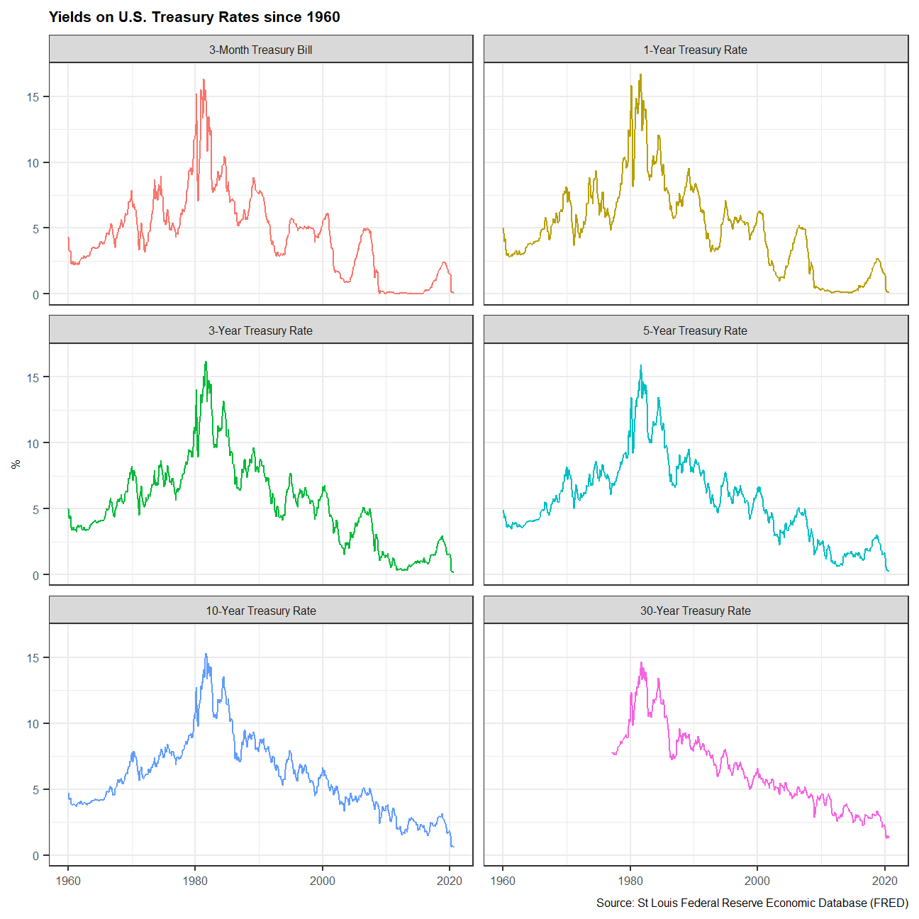
As you can see, yields went up and reached the peak around 1960s, then it gradually went down and became quite stable in the past decade.
Monthly yields on US rates by duration since 1999 on a year-by-year basis
To make it more clear, we plot the monthly yield by duration to see the difference across long-term yield and short-term yield in the past 20 years.
#add the year of date and filter yields since 1999
yield_curve2<- yield_curve%>%
  mutate(date=ymd(date),year=year(date))%>%
  filter(year>=1999)

#plot monthly yields on Us Treasury rates by different duration
ggplot(yield_curve2,aes(x=maturity,y=price))+
  geom_line(aes(colour=year,group=date),show.legend = FALSE)+

  #add labs
  labs(title= "US Yield Curve",
       x="Maturity",
       y="Yield(%)",
       caption = "Source: St Louis Federal Reserve Economic Database (FRED)")+

  #facet by maturity and reorder the them
  facet_wrap(~year,ncol=4,dir="h")+

  #adjust theme
  theme_bw()+
  theme(plot.title = element_text(size=8,face="bold"),
        plot.caption = element_text(size=6),
        strip.text = element_text(size=6),
        axis.text= element_text(size=6),
        axis.title = element_text(size=6))+
  NULL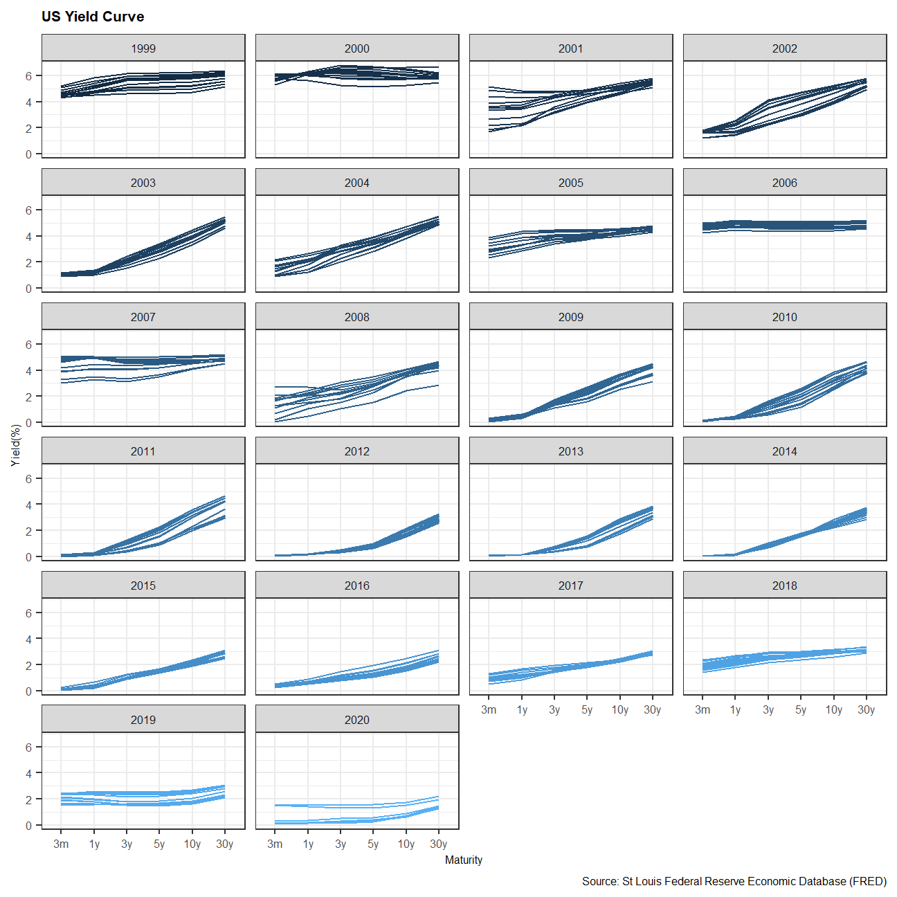
Obviously, the yield spread is flatter from year 1999-2000, and the same pattern appeared in period 2005-2006 and period 2018-2019. Except for the last one, the flatted yields could be related to the recessions in 2001 and 2007.
3-month and 10-year yields since 1999
Typically, we use the 3-month T-bills and 10-year US Treasury Bond rate to see how the rate spread change by years since 1999.
#filter 3-month T-Bills and 10-year Treasury rates since 1999
yield_curve3<- yield_curve%>%
  mutate(date=ymd(date),year=year(date))%>%
  filter(year>=1999,maturity%in%c("10y","3m"))

#plot yields change on 3-month T-Bills and 10-year Treasury Rate
ggplot(yield_curve3,aes(x=date,y=price))+
  geom_line(aes(colour=ordered_var,group=ordered_var),show.legend = TRUE)+

  #add labs
  labs(title= "Yields on 3-month and 10-year US Treasury rates since 1999",
       x=NULL,
       y="%",
       caption = "Source: St Louis Federal Reserve Economic Database (FRED)")+

  #change theme
  theme_bw()+
  theme(plot.title = element_text(size=8,face="bold"),
        plot.caption = element_text(size=6),
        axis.text= element_text(size=6),
        axis.title = element_text(size=6),
        legend.text = element_text(size=6),
        legend.title = element_blank())+
  NULL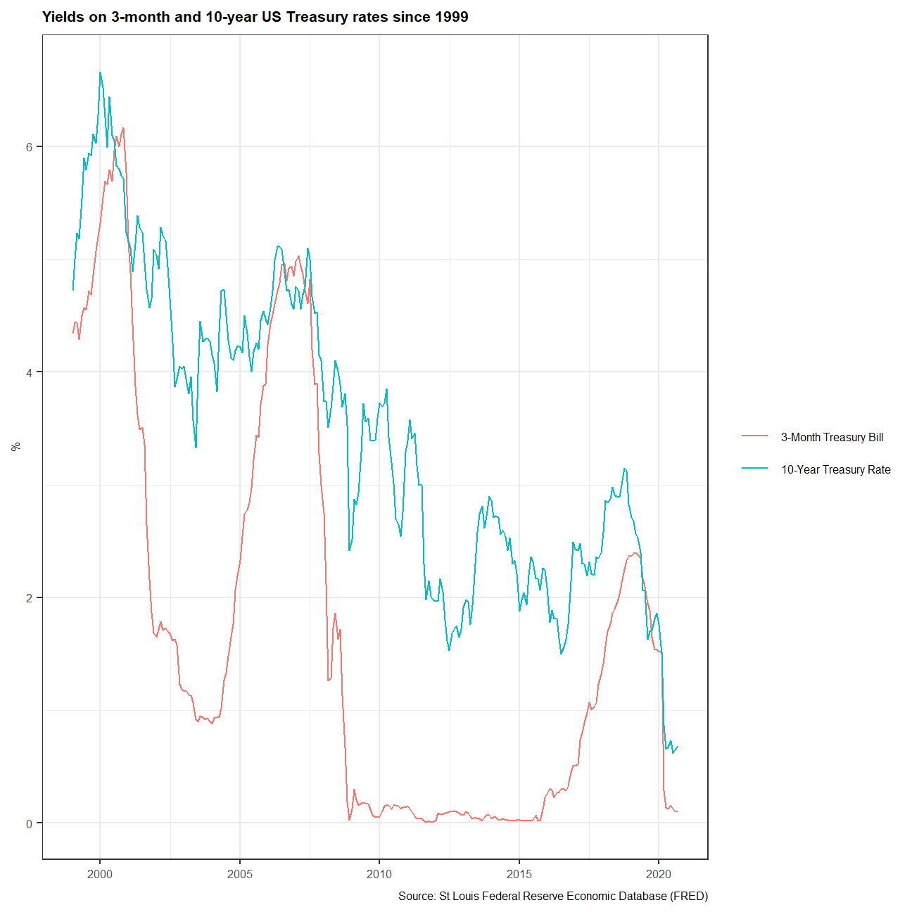
And we could get the same conclusion here, that the yield curve seem to flatten before the 2 recessions since 1999. However, a yield curve flattening didn’t always mean a recession is coming in the US. Before the breakout COVID-19, the yield curve flattened since 2018. Yet it is hard to say whether we are experiencing an recession if the pandemic didn’t exist.
We will take a look at this further by calculating the difference of 10-year yield and 3-month yield.
Plotting the spread
For the first, we create a dataframe with all US recessions since 1946:
# get US recession dates after 1946 from Wikipedia
# https://en.wikipedia.org/wiki/List_of_recessions_in_the_United_States

recessions <- tibble(
  from = c("1948-11-01", "1953-07-01", "1957-08-01", "1960-04-01", "1969-12-01", "1973-11-01", "1980-01-01","1981-07-01", "1990-07-01", "2001-03-01", "2007-12-01"),
  to = c("1949-10-01", "1954-05-01", "1958-04-01", "1961-02-01", "1970-11-01", "1975-03-01", "1980-07-01", "1982-11-01", "1991-03-01", "2001-11-01", "2009-06-01")
  )  %>%
  mutate(From = ymd(from),
         To=ymd(to),
         duration_days = To-From)

recessions
## # A tibble: 11 x 5
## from to From To duration_days
## <chr> <chr> <date> <date> <drtn>
## 1 1948-11-01 1949-10-01 1948-11-01 1949-10-01 334 days
## 2 1953-07-01 1954-05-01 1953-07-01 1954-05-01 304 days
## 3 1957-08-01 1958-04-01 1957-08-01 1958-04-01 243 days
## 4 1960-04-01 1961-02-01 1960-04-01 1961-02-01 306 days
## 5 1969-12-01 1970-11-01 1969-12-01 1970-11-01 335 days
## 6 1973-11-01 1975-03-01 1973-11-01 1975-03-01 485 days
## 7 1980-01-01 1980-07-01 1980-01-01 1980-07-01 182 days
## 8 1981-07-01 1982-11-01 1981-07-01 1982-11-01 488 days
## 9 1990-07-01 1991-03-01 1990-07-01 1991-03-01 243 days
## 10 2001-03-01 2001-11-01 2001-03-01 2001-11-01 245 days
## 11 2007-12-01 2009-06-01 2007-12-01 2009-06-01 548 daysWe choose the recessions after 1960 and tried to find the connection between the lower spread and recessions. Red areas shows the time that the 3-month yield excess 10-month yield, which suggests a negative yield spread.
#Calculate the spread since 1960: 10year - 3months
yield_curve4<- yield_curve%>%
  select(price,date,maturity)%>%
  pivot_wider(names_from="maturity",names_prefix="price_",values_from="price")%>%
  mutate(spread=price_10y-price_3m)

#filter the recessions since 1960
recessions1<-recessions%>%
  filter(year(From)>=1959)

library(scales)

#Replicate Graph for spread changes and recessions since 1960
ggplot(yield_curve4,aes(x=date,y=spread))+


  #Shaded areas correspond to recessions
  geom_rect(data=recessions1, inherit.aes=F, aes(xmin=From, xmax=To, ymin=-Inf, ymax=+Inf), fill='grey', alpha=0.5)+

  #plot spread
  geom_line(group=1,size=0.5,color="black")+

  #add line for zero spread
  geom_hline(aes(yintercept=0))+

  #color the positive spread blue and negative spread red
  geom_ribbon(aes(ymin=0,ymax=if_else(spread<0,spread,0)),
              fill="#EAB5B7",alpha=0.5)+
  geom_ribbon(aes(ymin=0,ymax=if_else(spread>0,spread,0)),
              fill="#2E74C0",alpha=0.5)+

  #Add rug bars at the bottom
  geom_rug(sides="b",
           aes(color=if_else(spread>0,"#EAB5B7","#2E74C0"),alpha=0.5),
           show.legend = FALSE)+

  #Add titles and caption
  labs(title="Yield Curve Inversion: 10-year minus 3-month U.S. Treasury rates",
       subtitle="Difference in % points, monthly averages \nShaded areas correspond to recessions",
       x=NULL,
       y="Difference (10 year-3 month) yield in %",
       caption="Source: FRED, Federal Reserve Bank of St. Louis")+

  #Adjust the axis and the theme
  scale_x_date(date_breaks="2 years",
               date_labels="%Y")+
  theme(panel.border = element_blank(),
        panel.background = element_blank(),
        panel.grid.minor = element_line(colour="#ECECEC"),
        panel.grid.major = element_line(colour="#ECECEC"),
        plot.title = element_text(size=10,face="bold"),
        plot.subtitle = element_text(size=6,face="italic"),
        plot.caption = element_text(size=6),
        axis.ticks= element_blank(),
        axis.text= element_text(size=6),
        axis.title = element_text(size=8))+
  NULL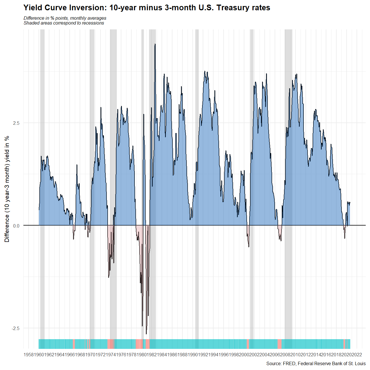
We could see that usually there’s a grey shaded area after the red-filled spread, which suggests recessions generally came after yield curve flattened. However, not all the yield curve flatten would lead to a recession in US, such as the yield curve flatten in 1966-1967. The expected recession didn’t show up until the spread became negative again in 3 years.