Country Comparison: Life Expectancy

gapminder dataset has data on life expectancy, population, and GDP per capita for 142 countries from 1952 to 2007.
Before the analysis, here’s a glipmse of the dataframe and the first 20 rows of data.
glimpse(gapminder)## Rows: 1,704
## Columns: 6
## $ country <fct> Afghanistan, Afghanistan, Afghanistan, Afghanistan, Afgha...
## $ continent <fct> Asia, Asia, Asia, Asia, Asia, Asia, Asia, Asia, Asia, Asi...
## $ year <int> 1952, 1957, 1962, 1967, 1972, 1977, 1982, 1987, 1992, 199...
## $ lifeExp <dbl> 28.801, 30.332, 31.997, 34.020, 36.088, 38.438, 39.854, 4...
## $ pop <int> 8425333, 9240934, 10267083, 11537966, 13079460, 14880372,...
## $ gdpPercap <dbl> 779.4453, 820.8530, 853.1007, 836.1971, 739.9811, 786.113...head(gapminder, 20) # look at the first 20 rows of the dataframe## # A tibble: 20 x 6
## country continent year lifeExp pop gdpPercap
## <fct> <fct> <int> <dbl> <int> <dbl>
## 1 Afghanistan Asia 1952 28.8 8425333 779.
## 2 Afghanistan Asia 1957 30.3 9240934 821.
## 3 Afghanistan Asia 1962 32.0 10267083 853.
## 4 Afghanistan Asia 1967 34.0 11537966 836.
## 5 Afghanistan Asia 1972 36.1 13079460 740.
## 6 Afghanistan Asia 1977 38.4 14880372 786.
## 7 Afghanistan Asia 1982 39.9 12881816 978.
## 8 Afghanistan Asia 1987 40.8 13867957 852.
## 9 Afghanistan Asia 1992 41.7 16317921 649.
## 10 Afghanistan Asia 1997 41.8 22227415 635.
## 11 Afghanistan Asia 2002 42.1 25268405 727.
## 12 Afghanistan Asia 2007 43.8 31889923 975.
## 13 Albania Europe 1952 55.2 1282697 1601.
## 14 Albania Europe 1957 59.3 1476505 1942.
## 15 Albania Europe 1962 64.8 1728137 2313.
## 16 Albania Europe 1967 66.2 1984060 2760.
## 17 Albania Europe 1972 67.7 2263554 3313.
## 18 Albania Europe 1977 68.9 2509048 3533.
## 19 Albania Europe 1982 70.4 2780097 3631.
## 20 Albania Europe 1987 72 3075321 3739.I would like to analyze how life expectancy has changed over the years for both China and Asia.
country_data <- gapminder %>%
            filter(country == "China")

continent_data <- gapminder %>%
            filter(continent == "Asia")
First of all, here’s the graph of life expectancy changing over time in China.
plot1 <- ggplot(data = country_data, mapping = aes(x = year, y = lifeExp))+
  geom_point() +
  geom_smooth(se = FALSE)+
  NULL

plot1
## `geom_smooth()` using method = 'loess' and formula 'y ~ x'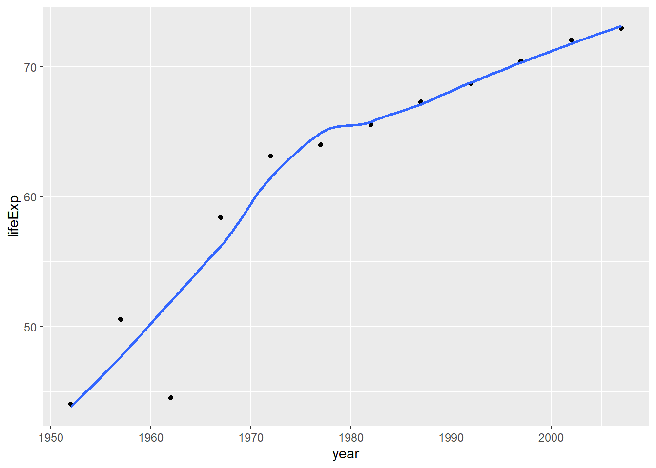
To make it more easy to understand, graph title and the labels for both axes are added in the following graph.
plot1 <- ggplot(data = country_data, mapping = aes(x = year, y = lifeExp))+
  geom_point() +
  geom_smooth(se = FALSE) +
  labs(title = "Life Expectancy Time Graph",
       subtitle = "in China",
       x = "Year",
       y = "Life Expectancy") +
  NULL

print(plot1)
## `geom_smooth()` using method = 'loess' and formula 'y ~ x'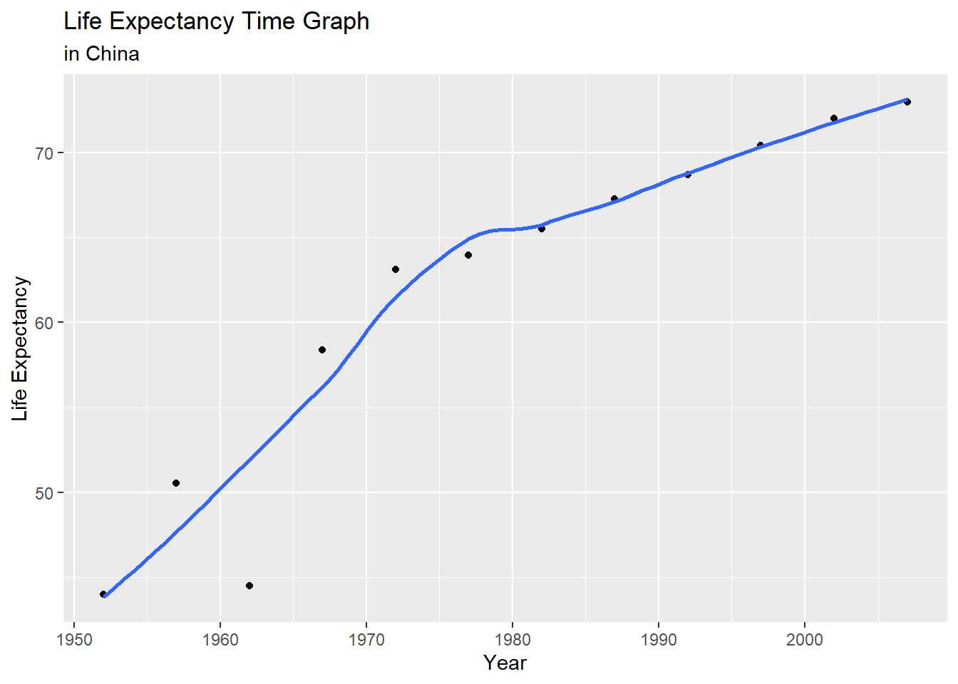
The life expectancy in China has been increasing since 1952. As for the speed of growth, life expectancy increased quickly from 1952 to 1970, and its growth speed started to slow down and become stable after 1972. The turning points are consistent with the historical revolution process in China.
Secondly, I’d like to compare life expectancy changes amoung all countries in Asia.
ggplot(data = continent_data , mapping = aes(x = year , y = lifeExp , colour=country))+
  geom_point()+
  geom_smooth(se = FALSE) +
  labs(title = "Life Expectancy Time Graph",
       subtitle = "Countries in Asia",
       x = "Year",
       y = "Life Expectancy") +
  NULL
## `geom_smooth()` using method = 'loess' and formula 'y ~ x'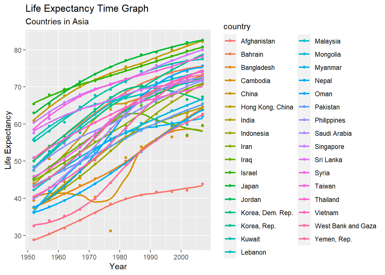
The life expectancy varies across different countries in the absolute value. For example, Afghanistan has an expected lifetime of less than 45 years now, which is much more lower than other countries. Different degree of development could led to this result.
Besides, the majority of countries in Asia shared the same trend, and this could be mainly driven by the pace of medical care development and the increasing macro economic.
Finally, a life expectancy over time graph is produced to compare global trends across continents.
ggplot(data = gapminder , mapping = aes(x = year , y = lifeExp , colour=country))+
  geom_point() +
  geom_smooth(se = FALSE) +
  facet_wrap(~continent) +
  theme(legend.position="none") +
  labs(title = "Life Expectancy Time Graph",
       subtitle = "Trends across Continents ",
       x = "Year",
       y = "Life Expectancy") +
  NULL
## `geom_smooth()` using method = 'loess' and formula 'y ~ x'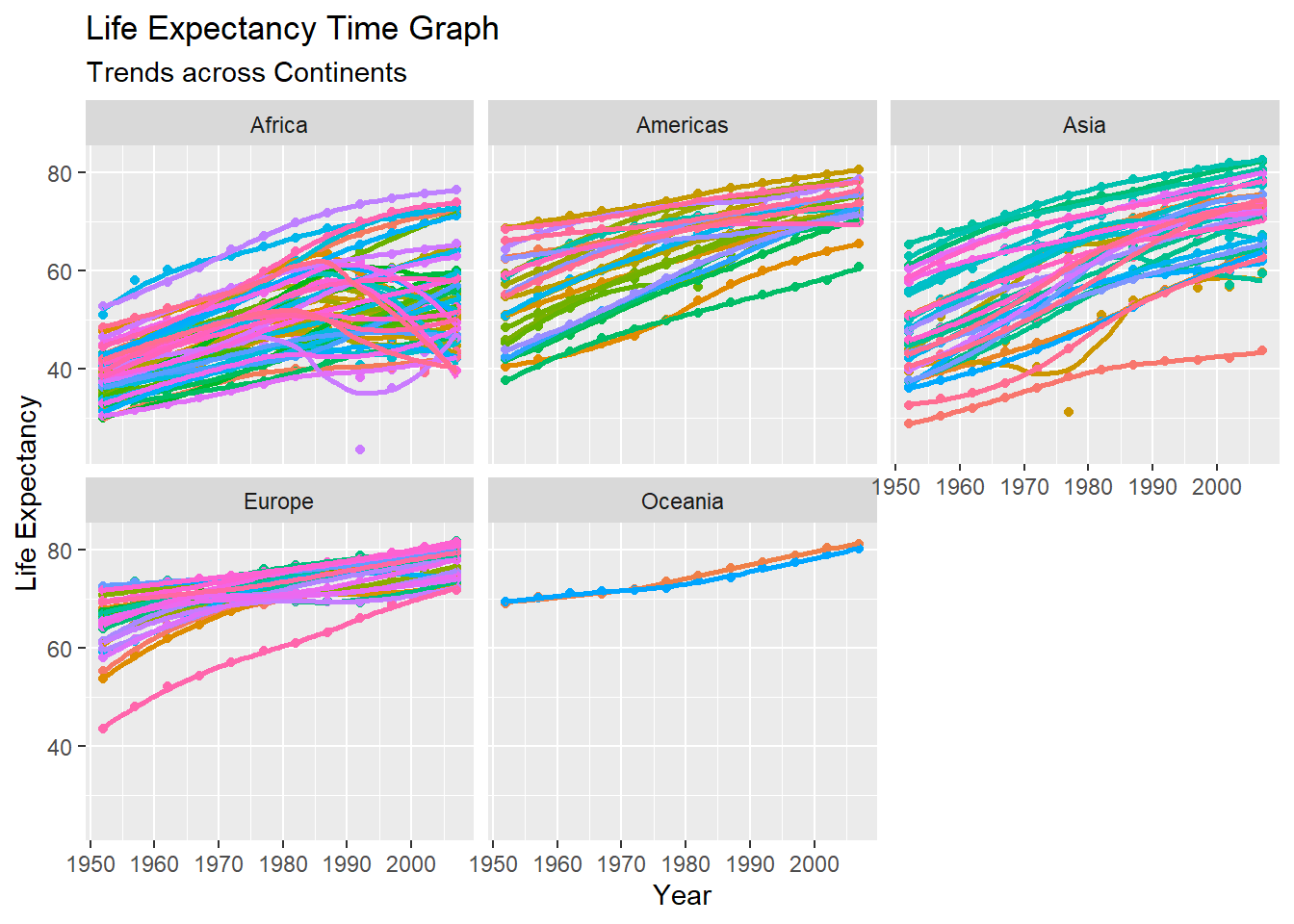
Basically, the life expectancy increases as time goes in all continents. Europe, Americas and Oceania started at a higher place in 1952, probably because they were relatively more developed at that time.
Growing economy and the development of medication could be the main factor that drives the increase. Recent growth speed in life expectancy has been slowing down, this could suggest that we are approaching the limit of human life in current situation.
Meanwhile, there are still many countries that whose life expectancy are still lower than 60 in Africa. And quite a few of them didn’t follow the generally increasing trend, which could be affected by pandemics, viruses and poor health care service.