Excess Rentals in TfL Bike Sharing
In this case, we are going to take a look at the excess rentals in TfL bike sharing.
Recall the TfL data on how many bikes were hired every single day. We can get the latest data by running the following
url <- "https://data.london.gov.uk/download/number-bicycle-hires/ac29363e-e0cb-47cc-a97a-e216d900a6b0/tfl-daily-cycle-hires.xlsx"

# Download TFL data to temporary file
httr::GET(url, write_disk(bike.temp <- tempfile(fileext = ".xlsx")))
## Response [https://airdrive-secure.s3-eu-west-1.amazonaws.com/london/dataset/number-bicycle-hires/2020-09-18T09%3A06%3A54/tfl-daily-cycle-hires.xlsx?X-Amz-Algorithm=AWS4-HMAC-SHA256&X-Amz-Credential=AKIAJJDIMAIVZJDICKHA%2F20201020%2Feu-west-1%2Fs3%2Faws4_request&X-Amz-Date=20201020T092140Z&X-Amz-Expires=300&X-Amz-Signature=540743054f661a81c8a6f0d9351ec6eb1b806bced8ae9527f86a2f02ae63eafd&X-Amz-SignedHeaders=host]
## Date: 2020-10-20 09:21
## Status: 200
## Content-Type: application/vnd.openxmlformats-officedocument.spreadsheetml.sheet
## Size: 165 kB
## <ON DISK> C:\Users\lenovo\AppData\Local\Temp\RtmpMxA8bT\file37703b573ace.xlsx# Use read_excel to read it as dataframe
bike0 <- read_excel(bike.temp,
sheet = "Data",
range = cell_cols("A:B"))
# change dates to get year, month, and week
bike <- bike0 %>%
clean_names() %>%
rename (bikes_hired = number_of_bicycle_hires) %>%
mutate (year = year(day),
month = lubridate::month(day, label = TRUE),
week = isoweek(day))We can easily create a facet grid that plots bikes hired by month and year.
knitr::include_graphics("/img/projects/tfl_distributions_monthly.png",error = FALSE)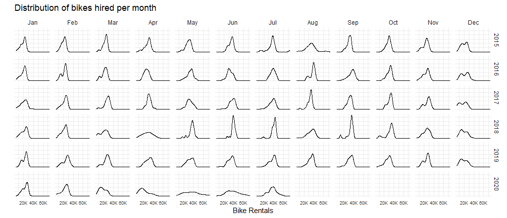
The distribution of bikes hired are relatively flat in May and June in 2020 compared with precious years. This has something to do with the pandemic. People stayed at home and many of them didn’t use bikes at all for the previous time.
Now we are going to look at the monthly excess bike rentals and weekly excess bike rentals from 2015-2019.
Estimates Based on Averages
The first one looks at the excess monthly rentals, which is the difference between actual monthly rentals and the expected monthly rentals. And we use the average number to calculated the monthly rentals. The red areas stand for negative excess rentals, and the green areas stand for positive excess rentals.
#Monthly rental changes
#compute the actual rentals - using mean
m_avg_bike_act<-bike%>%
  filter(year>=2015)%>%
  group_by(year,month)%>%
  summarise(month_avg=mean(bikes_hired))

#compute the expected rentals - using mean
m_avg_bike<-bike%>%
  filter(year %in% c(2015:2019))%>%
  group_by(month)%>%
  summarise(month_avg_exp=mean(bikes_hired))%>%
  left_join(y=m_avg_bike_act,join_by=month)%>%
  mutate(excess_month=month_avg-month_avg_exp)

#Replicate Figure1 - Graph for monthly changes
ggplot(m_avg_bike,aes(x=month,y=month_avg,group=1))+
  geom_line()+
  geom_line(aes(y=month_avg_exp,group=1),
            color="blue",
            size=1)+

  #color the monthly excess rentals each year
  geom_ribbon(aes(ymin=month_avg_exp,ymax=if_else(excess_month<0,month_avg,month_avg_exp)),
              fill=alpha("#CB454A",alpha=0.5))+
  geom_ribbon(aes(ymin=month_avg_exp,ymax=if_else(excess_month>0,month_avg,month_avg_exp)),
              fill=alpha("#7DCD85",alpha=0.5))+
  facet_wrap(~year)+

  #Add titles and caption
  labs(title="Monthly changes in TfL bike rentals",
       subtitle="Change from monthly average shown in blue \nand calculated between 2015-2019",
       x=NULL,
       y="Bike rentals",
       caption="Source: TfL, London Data Store")+

  #Adjust the theme
  theme(panel.border = element_blank(),
        panel.background = element_blank(),
        strip.background = element_blank(),
        panel.grid.minor = element_line(colour="#ECECEC"),
        panel.grid.major = element_line(colour="#ECECEC"),
        aspect.ratio = 1,
        plot.title = element_text(size=10,face="bold"),
        plot.subtitle = element_text(size=8),
        plot.caption = element_text(size=6),
        strip.text = element_text(size=6),
        axis.text= element_text(size=6),
        axis.title = element_text(size=6),
        axis.ticks= element_blank())+
  NULL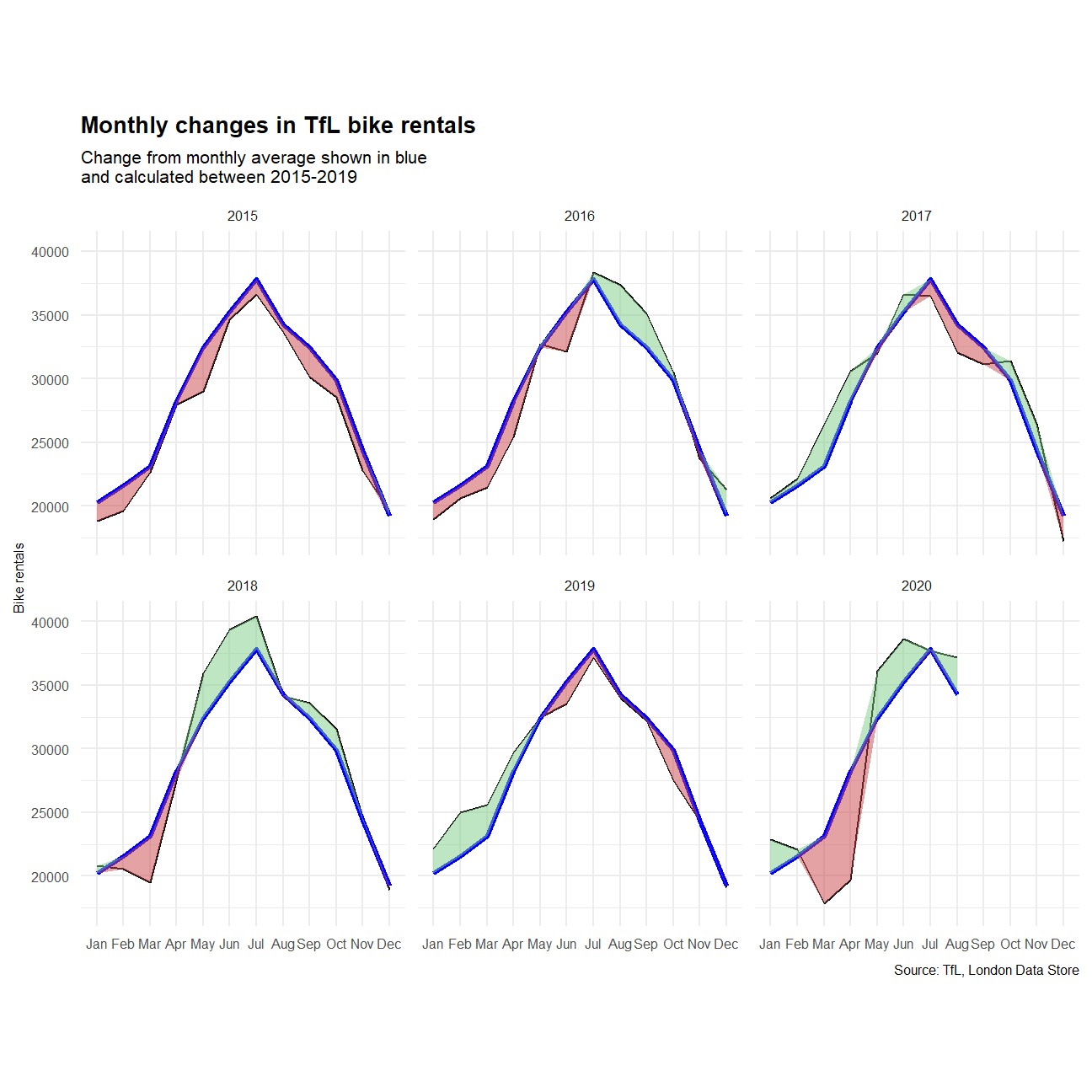
The second one looks at percentage changes from the expected level of weekly rentals. And we use the average number for calculation as well. Besides, we add two grey-shaded rectangles, which correspond to the second and fourth quarters.
#Weekly rental changes
#compute the actual rentals - using mean
w_avg_bike_act<-bike%>%
  filter(year>=2015)%>%
  group_by(year,week)%>%
  summarise(week_avg=mean(bikes_hired))

#compute the expected rentals - using mean
w_avg_bike<-bike%>%
  filter(year %in% c(2015:2019))%>%
  group_by(week)%>%
  summarise(week_avg_exp=mean(bikes_hired))%>%
  left_join(y=w_avg_bike_act,join_by=week)%>%
  mutate(excess_week_pct=week_avg/week_avg_exp-1)

#Replicate Graph for monthly changes
ggplot(w_avg_bike,aes(x=week,y=excess_week_pct,group=1))+

  #Add gray-shaded rectangles for Q2 & Q4
  geom_rect(aes(xmin=13,xmax=26,ymin=-Inf,ymax=Inf),
            fill=alpha("#EDEDED",alpha=0.5),
            color="#EDEDED",
            show.legend = FALSE)+
  geom_rect(aes(xmin=39,xmax=53,ymin=-Inf,ymax=Inf),
            fill=alpha("#EDEDED",alpha=0.5),
            color="#EDEDED",
            show.legend = FALSE)+

  #plot %change of weekly average rentals
  geom_line(size=0.5,color="black")+

  #color the %weekly excess rentals
  geom_ribbon(aes(ymin=0,ymax=if_else(excess_week_pct<0,excess_week_pct,0)),
              fill=alpha("#CB454A",alpha=0.5))+
  geom_ribbon(aes(ymin=0,ymax=if_else(excess_week_pct>0,excess_week_pct,0)),
              fill=alpha("#7DCD85",alpha=0.5))+

  #Add rug bars at the bottom of each panel
  geom_rug(sides="b",
           aes(color=if_else(excess_week_pct>0,alpha("#CB454A",alpha=0.5),alpha("#7DCD85",alpha=0.5))),
           show.legend = FALSE)+
  facet_wrap(~year)+

  #Add titles and caption
  labs(title="Weekly changes in TfL bike rentals",
       subtitle="% change from weekly averages \ncalculated between 2015-2019",
       x="week",
       y=NULL,
       caption="Source:TfL, London Data Store")+

  #Adjust the axis and the theme
  scale_y_continuous(labels =scales::percent)+
  scale_x_continuous(breaks = c(13,26,39,53),labels = c("13","26","39","53"))+
  theme(panel.border = element_blank(),
        panel.background = element_blank(),
        strip.background = element_blank(),
        panel.grid.minor = element_line(colour="#ECECEC"),
        panel.grid.major = element_line(colour="#ECECEC"),
        aspect.ratio = 1,
        plot.title = element_text(size=10,face="bold"),
        plot.subtitle = element_text(size=8),
        plot.caption = element_text(size=6),
        strip.text = element_text(size=6),
        axis.ticks= element_blank(),
        axis.text= element_text(size=6),
        axis.title = element_text(size=6))+
  NULL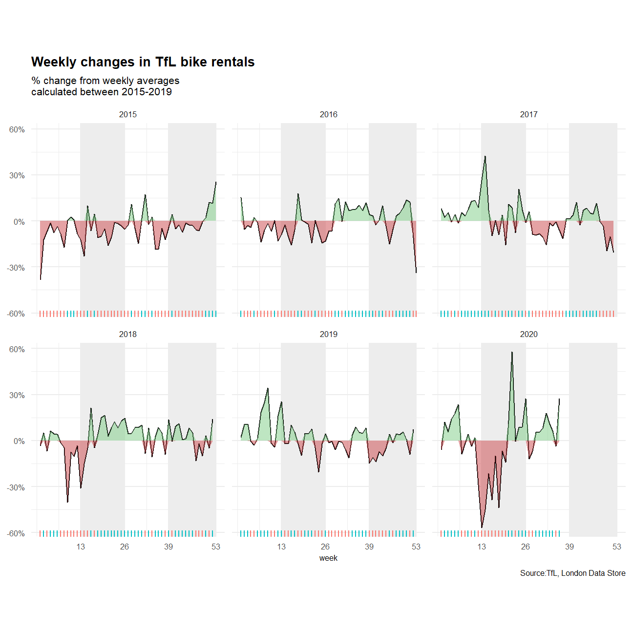
According to the figures above, we could see that both the monthly expected rentals and the weekly expected rentals are much higher than actual rentals earlier in 2020, yet situation reversed in May and June. The easing COVID-19 restrictions from May may lead to this reverse.
Estimates Based on Medians
Since the mean of bikes hired may be more affected by the outliers, especially in 2020 considering the pandemic’s impacts, we re-estimate based on the median of bikes hired and try to see if there’s any difference in the result.
Here’s the result of absolute monthly changes from 2015-2020.
#Monthly rental changes
#compute the actual rentals - using median
m_avg_bike_act2<-bike%>%
  filter(year>=2015)%>%
  group_by(year,month)%>%
  summarise(month_avg=median(bikes_hired))

#compute the expected rentals - using median
m_avg_bike2<-bike%>%
  filter(year %in% c(2015:2019))%>%
  group_by(month)%>%
  summarise(month_avg_exp=median(bikes_hired))%>%
  left_join(y=m_avg_bike_act2,join_by=month)%>%
  mutate(excess_month=month_avg-month_avg_exp)

#Replicate Figure1 - Graph for monthly changes
ggplot(m_avg_bike2,aes(x=month,y=month_avg,group=1))+
  geom_line()+
  geom_line(aes(y=month_avg_exp,group=1),
            color="blue",
            size=1)+

  #color the monthly excess rentals each year
  geom_ribbon(aes(ymin=month_avg_exp,ymax=if_else(excess_month<0,month_avg,month_avg_exp)),
              fill=alpha("#CB454A",alpha=0.5))+
  geom_ribbon(aes(ymin=month_avg_exp,ymax=if_else(excess_month>0,month_avg,month_avg_exp)),
              fill=alpha("#7DCD85",alpha=0.5))+
  facet_wrap(~year)+

  #Add titles and caption
  labs(title="Monthly changes in TfL bike rentals",
       subtitle="Change from monthly median shown in blue \nand calculated between 2015-2019",
       x=NULL,
       y="Bike rentals",
       caption="Source: TfL, London Data Store")+

  #Adjust the theme
  theme(panel.border = element_blank(),
        panel.background = element_blank(),
        strip.background = element_blank(),
        panel.grid.minor = element_line(colour="#ECECEC"),
        panel.grid.major = element_line(colour="#ECECEC"),
        aspect.ratio = 1,
        plot.title = element_text(size=10,face="bold"),
        plot.subtitle = element_text(size=8),
        plot.caption = element_text(size=6),
        strip.text = element_text(size=6),
        axis.text= element_text(size=6),
        axis.title = element_text(size=6),
        axis.ticks= element_blank())+
  NULL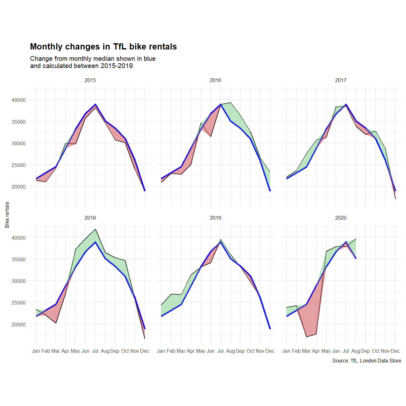
As you can see, although the actual monthly rentals in March and April in 2020 are still far below the expectation, the monthly excess rentals calculated in median are less than that calculated in mean. And this also suggests that the number of hired bikes came back to the normal level in July,2020, which is also consistent to the distribution of bikes hired per month.
Same conclusion could be driven in the weekly excess rentals.
#Weekly rental changes
#compute the actual rentals - using median
w_avg_bike_act2<-bike%>%
  filter(year>=2015)%>%
  group_by(year,week)%>%
  summarise(week_avg=median(bikes_hired))

#compute the expected rentals - using median
w_avg_bike2<-bike%>%
  filter(year %in% c(2015:2019))%>%
  group_by(week)%>%
  summarise(week_avg_exp=median(bikes_hired))%>%
  left_join(y=w_avg_bike_act2,join_by=week)%>%
  mutate(excess_week_pct=week_avg/week_avg_exp-1)

#Replicate Graph for monthly changes
ggplot(w_avg_bike2,aes(x=week,y=excess_week_pct,group=1))+

  #Add gray-shaded rectangles for Q2 & Q4
  geom_rect(aes(xmin=13,xmax=26,ymin=-Inf,ymax=Inf),
            fill=alpha("#EDEDED",alpha=0.5),
            color="#EDEDED",
            show.legend = FALSE)+
  geom_rect(aes(xmin=39,xmax=53,ymin=-Inf,ymax=Inf),
            fill=alpha("#EDEDED",alpha=0.5),
            color="#EDEDED",
            show.legend = FALSE)+

  #plot %change of weekly average rentals
  geom_line(size=0.5,color="black")+

  #color the %weekly excess rentals
  geom_ribbon(aes(ymin=0,ymax=if_else(excess_week_pct<0,excess_week_pct,0)),
              fill=alpha("#CB454A",alpha=0.5))+
  geom_ribbon(aes(ymin=0,ymax=if_else(excess_week_pct>0,excess_week_pct,0)),
              fill=alpha("#7DCD85",alpha=0.5))+

  #Add rug bars at the bottom of each panel
  geom_rug(sides="b",
           aes(color=if_else(excess_week_pct>0,alpha("#CB454A",alpha=0.5),alpha("#7DCD85",alpha=0.5))),
           show.legend = FALSE)+
  facet_wrap(~year)+

  #Add titles and caption
  labs(title="Weekly changes in TfL bike rentals",
       subtitle="% change from weekly medians \ncalculated between 2015-2019",
       x="week",
       y=NULL,
       caption="Source: TfL, London Data Store")+

  #Adjust the axis and the theme
  scale_y_continuous(labels =scales::percent)+
  scale_x_continuous(breaks = c(13,26,39,53),labels = c("13","26","39","53"))+
  theme(panel.border = element_blank(),
        panel.background = element_blank(),
        strip.background = element_blank(),
        panel.grid.minor = element_line(colour="#ECECEC"),
        panel.grid.major = element_line(colour="#ECECEC"),
        aspect.ratio = 1,
        plot.title = element_text(size=10,face="bold"),
        plot.subtitle = element_text(size=8),
        plot.caption = element_text(size=6),
        strip.text = element_text(size=6),
        axis.ticks= element_blank(),
        axis.text= element_text(size=6),
        axis.title = element_text(size=6))+
  NULL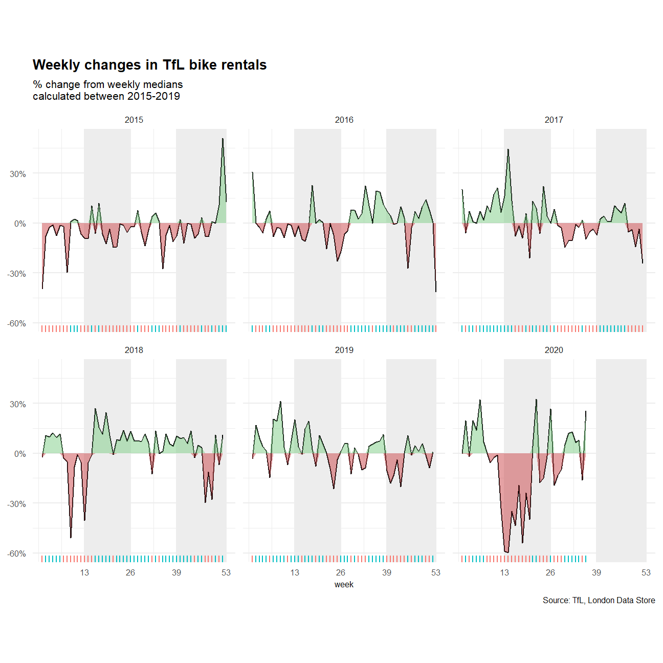
Here’s the difference between the monthly expected rentals calculated in different ways. Generally, the difference between monthly average and monthly median is negative, which suggests a left-skewed distribution. What’s more, the difference of actual monthly rentals fluctuates a lot in 2020, and the difference of expected monthly rentals would be more stable because of the 5-year window.
Again, similar conclusions could be found from the perspective of weekly rentals.
#compute difference in actual rentals - monthly
m_diff_act<-bike%>%
  filter(year>=2015)%>%
  group_by(year,month)%>%
  summarise(m_avg=mean(bikes_hired),
            m_median=median(bikes_hired))%>%
  mutate(act_avg_median_diff=m_avg-m_median)

#compute difference in expected rentals - monthly
m_diff<-bike%>%
  filter(year %in% c(2015:2019))%>%
  group_by(month)%>%
  summarise(m_avg_exp=mean(bikes_hired),
            m_median_exp=median(bikes_hired))%>%
  mutate(exp_avg_median_diff=m_avg_exp-m_median_exp)%>%
  left_join(y=m_diff_act,join_by=month)

#plot the differences
ggplot(m_diff,aes(x=month,y=act_avg_median_diff,group=1))+
  geom_line()+
  geom_line(aes(x=month,y=exp_avg_median_diff),group=1,color="red",size=1)+
  geom_hline(aes(yintercept=0),linetype="dashed")+
  facet_wrap(~year)+

  #Add titles and caption
  labs(title="Difference in monthly average and monthly median: actual rentals and expected rentals",
       subtitle="Difference in expected monthly rentals shown in red \nand calculated between 2015-2019",
       x=NULL,
       y="Bike rentals: Average-Median",
       caption="Source: TfL, London Data Store")+

  #Adjust the theme
  theme(panel.border = element_blank(),
        panel.background = element_blank(),
        strip.background = element_blank(),
        panel.grid.minor = element_line(colour="#ECECEC"),
        panel.grid.major = element_line(colour="#ECECEC"),
        aspect.ratio = 1,
        plot.title = element_text(size=10,face="bold"),
        plot.subtitle = element_text(size=8),
        plot.caption = element_text(size=6),
        strip.text = element_text(size=6),
        axis.text= element_text(size=6),
        axis.title = element_text(size=6),
        axis.ticks= element_blank())+
  NULL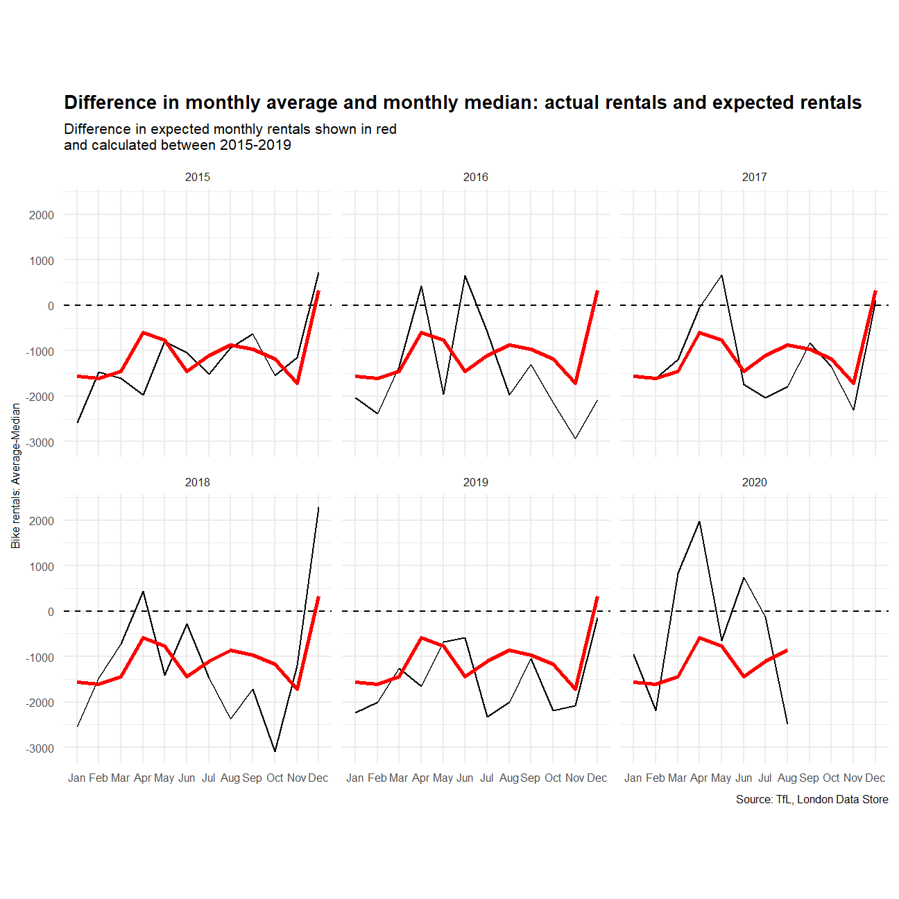
#compute difference in actual rentals - weekly
w_diff_act<-bike%>%
  filter(year>=2015)%>%
  group_by(year,week)%>%
  summarise(w_avg=mean(bikes_hired),
            w_median=median(bikes_hired))%>%
  mutate(act_avg_median_diff=w_avg-w_median)

#compute difference in expected rentals - monthly
w_diff<-bike%>%
  filter(year %in% c(2015:2019))%>%
  group_by(week)%>%
  summarise(w_avg_exp=mean(bikes_hired),
            w_median_exp=median(bikes_hired))%>%
  mutate(exp_avg_median_diff=w_avg_exp-w_median_exp)%>%
  left_join(y=w_diff_act,join_by=week)

#plot the differences
ggplot(w_diff,aes(x=week,y=act_avg_median_diff,group=1))+
  geom_line()+
  geom_line(aes(x=week,y=exp_avg_median_diff),group=1,color="red",size=1)+
  geom_hline(aes(yintercept=0),linetype="dashed")+
  facet_wrap(~year)+

  #Add titles and caption
  labs(title="Difference in weekly average and weekly median: actual rentals and expected rentals",
       subtitle="Difference in expected weekly rentals shown in red \nand calculated between 2015-2019",
       x="Week",
       y="Bike rentals: Average-Median",
       caption="Source: TfL, London Data Store")+

  #Adjust the theme
  theme(panel.border = element_blank(),
        panel.background = element_blank(),
        strip.background = element_blank(),
        panel.grid.minor = element_line(colour="#ECECEC"),
        panel.grid.major = element_line(colour="#ECECEC"),
        aspect.ratio = 1,
        plot.title = element_text(size=10,face="bold"),
        plot.subtitle = element_text(size=8),
        plot.caption = element_text(size=6),
        strip.text = element_text(size=6),
        axis.text= element_text(size=6),
        axis.title = element_text(size=6),
        axis.ticks= element_blank())+
  NULL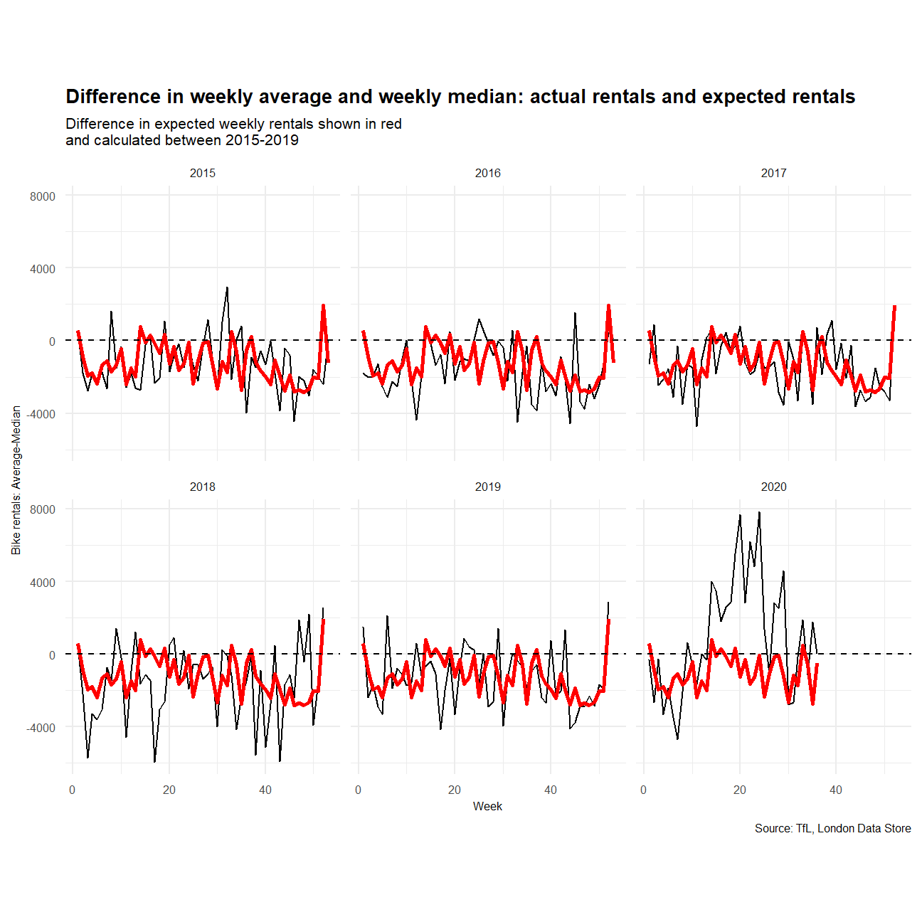
Overall, using the median might be a better way to calculate the expected rentals since it’s more stable and hardly affected by the outliers.