IBM HR Analytics

In this case, we will analyze a data set on Human Resource Analytics. The IBM HR Analytics Employee Attrition & Performance data set is a fictional data set created by IBM data scientists.
knitr::opts_chunk$set(
  message = FALSE,
  warning = FALSE,
  tidy=FALSE,     # display code as typed
  size="small")   # slightly smaller font for code
options(digits = 3)

# default figure size
knitr::opts_chunk$set(
  fig.width=6.75,
  fig.height=6.75,
  fig.align = "center"
)
library(tidyverse) # Load ggplot2, dplyr, and all the other tidyverse packages
library(mosaic)
library(ggthemes)
library(lubridate)
library(fivethirtyeight)
library(here)
library(skimr)
library(janitor)
library(vroom)
library(tidyquant)
library(rvest) # scrape websites
library(purrr)
library(lubridate) #to handle dates
library(kableExtra)First let us load the data.
hr_dataset <- read_csv(here::here("data", "datasets_1067_1925_WA_Fn-UseC_-HR-Employee-Attrition.csv"))
glimpse(hr_dataset)
## Rows: 1,470
## Columns: 35
## $ Age <dbl> 41, 49, 37, 33, 27, 32, 59, 30, 38, 36, 35...
## $ Attrition <chr> "Yes", "No", "Yes", "No", "No", "No", "No"...
## $ BusinessTravel <chr> "Travel_Rarely", "Travel_Frequently", "Tra...
## $ DailyRate <dbl> 1102, 279, 1373, 1392, 591, 1005, 1324, 13...
## $ Department <chr> "Sales", "Research & Development", "Resear...
## $ DistanceFromHome <dbl> 1, 8, 2, 3, 2, 2, 3, 24, 23, 27, 16, 15, 2...
## $ Education <dbl> 2, 1, 2, 4, 1, 2, 3, 1, 3, 3, 3, 2, 1, 2, ...
## $ EducationField <chr> "Life Sciences", "Life Sciences", "Other",...
## $ EmployeeCount <dbl> 1, 1, 1, 1, 1, 1, 1, 1, 1, 1, 1, 1, 1, 1, ...
## $ EmployeeNumber <dbl> 1, 2, 4, 5, 7, 8, 10, 11, 12, 13, 14, 15, ...
## $ EnvironmentSatisfaction <dbl> 2, 3, 4, 4, 1, 4, 3, 4, 4, 3, 1, 4, 1, 2, ...
## $ Gender <chr> "Female", "Male", "Male", "Female", "Male"...
## $ HourlyRate <dbl> 94, 61, 92, 56, 40, 79, 81, 67, 44, 94, 84...
## $ JobInvolvement <dbl> 3, 2, 2, 3, 3, 3, 4, 3, 2, 3, 4, 2, 3, 3, ...
## $ JobLevel <dbl> 2, 2, 1, 1, 1, 1, 1, 1, 3, 2, 1, 2, 1, 1, ...
## $ JobRole <chr> "Sales Executive", "Research Scientist", "...
## $ JobSatisfaction <dbl> 4, 2, 3, 3, 2, 4, 1, 3, 3, 3, 2, 3, 3, 4, ...
## $ MaritalStatus <chr> "Single", "Married", "Single", "Married", ...
## $ MonthlyIncome <dbl> 5993, 5130, 2090, 2909, 3468, 3068, 2670, ...
## $ MonthlyRate <dbl> 19479, 24907, 2396, 23159, 16632, 11864, 9...
## $ NumCompaniesWorked <dbl> 8, 1, 6, 1, 9, 0, 4, 1, 0, 6, 0, 0, 1, 0, ...
## $ Over18 <chr> "Y", "Y", "Y", "Y", "Y", "Y", "Y", "Y", "Y...
## $ OverTime <chr> "Yes", "No", "Yes", "Yes", "No", "No", "Ye...
## $ PercentSalaryHike <dbl> 11, 23, 15, 11, 12, 13, 20, 22, 21, 13, 13...
## $ PerformanceRating <dbl> 3, 4, 3, 3, 3, 3, 4, 4, 4, 3, 3, 3, 3, 3, ...
## $ RelationshipSatisfaction <dbl> 1, 4, 2, 3, 4, 3, 1, 2, 2, 2, 3, 4, 4, 3, ...
## $ StandardHours <dbl> 80, 80, 80, 80, 80, 80, 80, 80, 80, 80, 80...
## $ StockOptionLevel <dbl> 0, 1, 0, 0, 1, 0, 3, 1, 0, 2, 1, 0, 1, 1, ...
## $ TotalWorkingYears <dbl> 8, 10, 7, 8, 6, 8, 12, 1, 10, 17, 6, 10, 5...
## $ TrainingTimesLastYear <dbl> 0, 3, 3, 3, 3, 2, 3, 2, 2, 3, 5, 3, 1, 2, ...
## $ WorkLifeBalance <dbl> 1, 3, 3, 3, 3, 2, 2, 3, 3, 2, 3, 3, 2, 3, ...
## $ YearsAtCompany <dbl> 6, 10, 0, 8, 2, 7, 1, 1, 9, 7, 5, 9, 5, 2,...
## $ YearsInCurrentRole <dbl> 4, 7, 0, 7, 2, 7, 0, 0, 7, 7, 4, 5, 2, 2, ...
## $ YearsSinceLastPromotion <dbl> 0, 1, 0, 3, 2, 3, 0, 0, 1, 7, 0, 0, 4, 1, ...
## $ YearsWithCurrManager <dbl> 5, 7, 0, 0, 2, 6, 0, 0, 8, 7, 3, 8, 3, 2, ...I am going to clean the data set, as variable names are in capital letters, some variables are not really necessary, and some variables, e.g., education are given as a number rather than a more useful description
hr_cleaned <- hr_dataset %>%
  clean_names() %>%
  mutate(
    education = case_when(
      education == 1 ~ "Below College",
      education == 2 ~ "College",
      education == 3 ~ "Bachelor",
      education == 4 ~ "Master",
      education == 5 ~ "Doctor"
    ),
    environment_satisfaction = case_when(
      environment_satisfaction == 1 ~ "Low",
      environment_satisfaction == 2 ~ "Medium",
      environment_satisfaction == 3 ~ "High",
      environment_satisfaction == 4 ~ "Very High"
    ),
    job_satisfaction = case_when(
      job_satisfaction == 1 ~ "Low",
      job_satisfaction == 2 ~ "Medium",
      job_satisfaction == 3 ~ "High",
      job_satisfaction == 4 ~ "Very High"
    ),
    performance_rating = case_when(
      performance_rating == 1 ~ "Low",
      performance_rating == 2 ~ "Good",
      performance_rating == 3 ~ "Excellent",
      performance_rating == 4 ~ "Outstanding"
    ),
    work_life_balance = case_when(
      work_life_balance == 1 ~ "Bad",
      work_life_balance == 2 ~ "Good",
      work_life_balance == 3 ~ "Better",
      work_life_balance == 4 ~ "Best"
    )
  ) %>%
  select(age, attrition, daily_rate, department,
         distance_from_home, education,
         gender, job_role,environment_satisfaction,
         job_satisfaction, marital_status,
         monthly_income, num_companies_worked, percent_salary_hike,
         performance_rating, total_working_years,
         work_life_balance, years_at_company,
         years_since_last_promotion)
How often do people leave the company ?
leave <- hr_cleaned%>%
  group_by(attrition)%>%
  count()%>%
  ungroup()%>%
  mutate(pct_job_satisfaction=n/sum(n))
ggplot(leave,aes(x=attrition,y=n))+
  geom_col(fill="light blue")+
  labs(title="The attrition rate of IBM is 16.1%",
       x="Attrtion",
       y="Number of people")+
  theme_clean()+
  NULL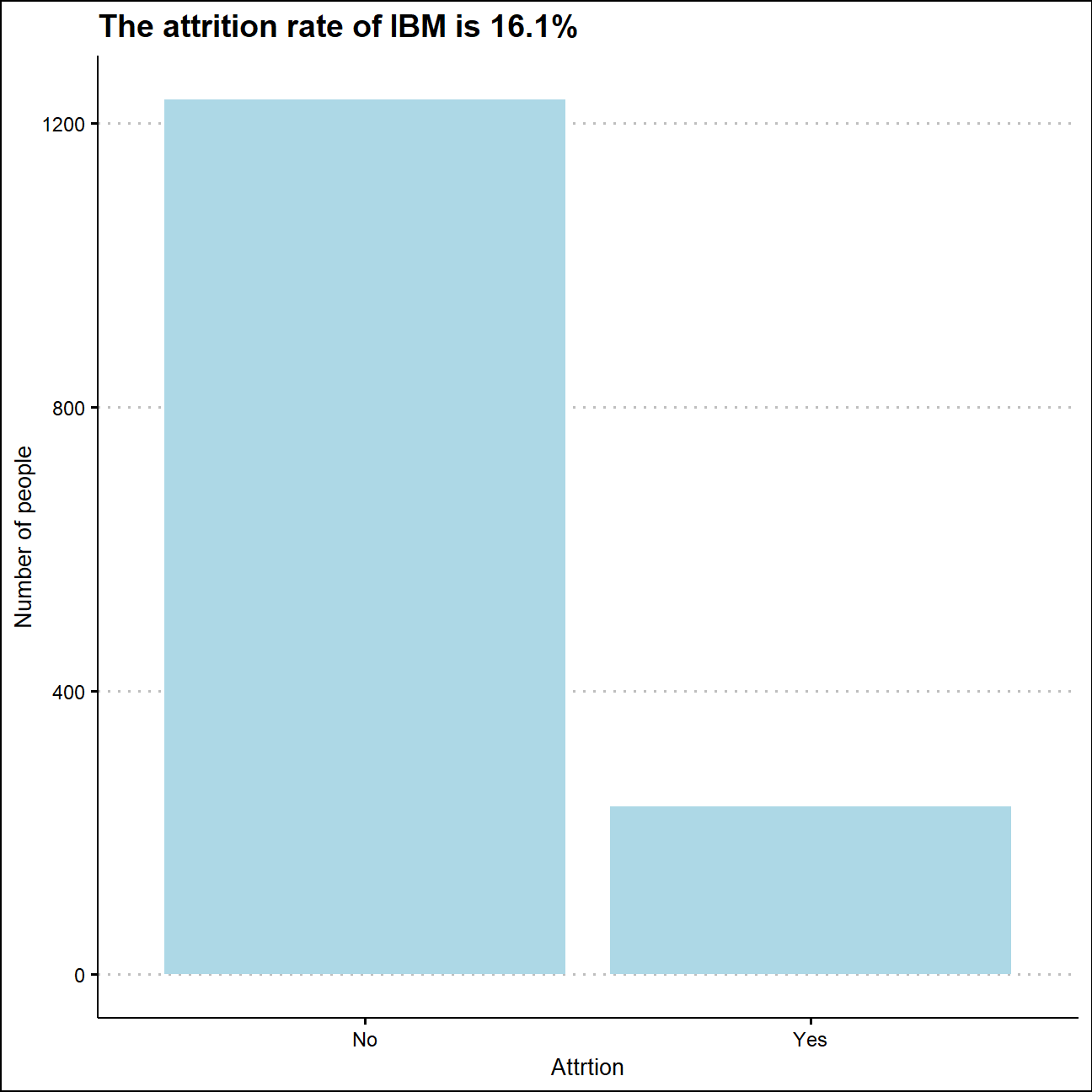
There are 1470 observations in the dataset, and 237 employees left the company. Therefore, the attrition rate is 16.1%.
How are age, years_at_company, monthly_income and years_since_last_promotion distributed?
First of all, let’s take a look at the summary statistics.
summary(hr_cleaned)## age attrition daily_rate department
## Min. :18.0 Length:1470 Min. : 102 Length:1470
## 1st Qu.:30.0 Class :character 1st Qu.: 465 Class :character
## Median :36.0 Mode :character Median : 802 Mode :character
## Mean :36.9 Mean : 802
## 3rd Qu.:43.0 3rd Qu.:1157
## Max. :60.0 Max. :1499
## distance_from_home education gender job_role
## Min. : 1.00 Length:1470 Length:1470 Length:1470
## 1st Qu.: 2.00 Class :character Class :character Class :character
## Median : 7.00 Mode :character Mode :character Mode :character
## Mean : 9.19
## 3rd Qu.:14.00
## Max. :29.00
## environment_satisfaction job_satisfaction marital_status monthly_income
## Length:1470 Length:1470 Length:1470 Min. : 1009
## Class :character Class :character Class :character 1st Qu.: 2911
## Mode :character Mode :character Mode :character Median : 4919
## Mean : 6503
## 3rd Qu.: 8379
## Max. :19999
## num_companies_worked percent_salary_hike performance_rating
## Min. :0.00 Min. :11.0 Length:1470
## 1st Qu.:1.00 1st Qu.:12.0 Class :character
## Median :2.00 Median :14.0 Mode :character
## Mean :2.69 Mean :15.2
## 3rd Qu.:4.00 3rd Qu.:18.0
## Max. :9.00 Max. :25.0
## total_working_years work_life_balance years_at_company
## Min. : 0.0 Length:1470 Min. : 0
## 1st Qu.: 6.0 Class :character 1st Qu.: 3
## Median :10.0 Mode :character Median : 5
## Mean :11.3 Mean : 7
## 3rd Qu.:15.0 3rd Qu.: 9
## Max. :40.0 Max. :40
## years_since_last_promotion
## Min. : 0.00
## 1st Qu.: 0.00
## Median : 1.00
## Mean : 2.19
## 3rd Qu.: 3.00
## Max. :15.00Age <- hr_cleaned %>%
summarise(min = min(age),max = max(age), median=median(age), mean=mean(age), sd = sd(age))
Monthly_income <- hr_cleaned %>%
summarise(min = min(monthly_income),max = max(monthly_income), median=median(monthly_income), mean=mean(monthly_income), sd = sd(monthly_income))
Year_since_last_promotion <- hr_cleaned %>%
summarise(min = min(years_since_last_promotion),max = max(years_since_last_promotion), median=median(years_since_last_promotion), mean=mean(years_since_last_promotion), sd = sd(years_since_last_promotion))
stats_basic<-bind_rows(Age,Monthly_income,Year_since_last_promotion)
Factors<-c("Age","Monthly Income","Year Since Last Promotion")
stats_all<-bind_cols(Factors,stats_basic)
stats_all%>%
kbl()%>%
kable_styling()| …1 | min | max | median | mean | sd |
|---|---|---|---|---|---|
| Age | 18 | 60 | 36 | 36.92 | 9.13 |
| Monthly Income | 1009 | 19999 | 4919 | 6502.93 | 4707.96 |
| Year Since Last Promotion | 0 | 15 | 1 | 2.19 | 3.22 |
Employees have an average age of nearly 37 in this company, and their average monthly income is 6502. And the average year since their last promotion is 2.19 years. Compared with the other 2 variables, the mean and median of employees’ age are close, and this value is nearly in the middle of total spread. Therefore, the distribution of age is closer to normal just by looking at summary statistics.
Here are the distributions of the age, monthly income of the employees and years since their last promotion. And the graphs below confirmed our guessing.
ggplot(hr_cleaned,aes(x=age))+
  geom_density(fill="light blue",color="blue")+
  labs(title = "Distribution of Age",
       x="Age",
       y="Density")+
  theme_clean()+
  NULL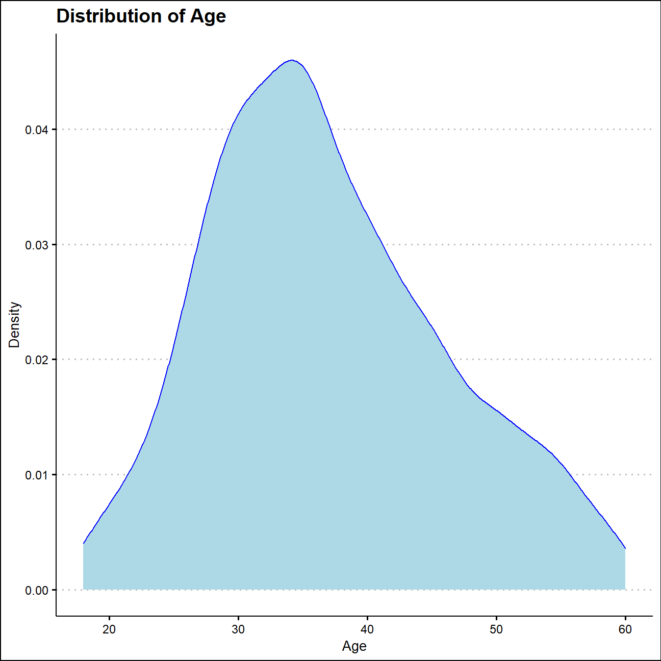
ggplot(hr_cleaned,aes(x=monthly_income))+
  geom_density(fill="light blue",color="blue")+
  labs(title = "Distribution of Monthly Income",
       x="Monthly Income",
       y="Density")+
  theme_clean()+
  NULL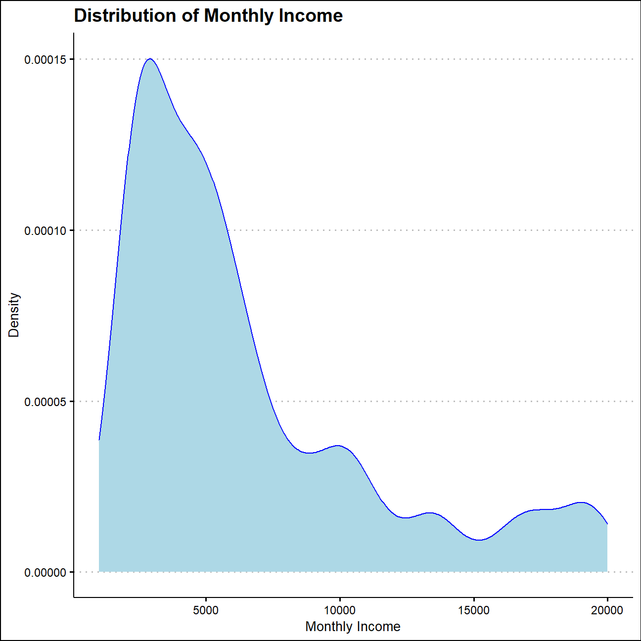
ggplot(hr_cleaned,aes(x=years_since_last_promotion))+
  geom_density(fill="light blue",color="blue")+
  labs(title = "Distribution of Years Since Last Promotion",
       x="Years",
       y="Density")+
  theme_clean()+
  NULL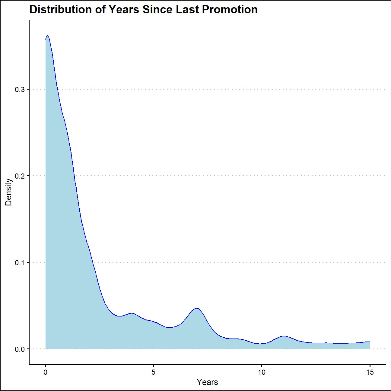
The distribution of monthly income and years since last promotion are obviously not symmetrical and typically right skewed. While half of the employees would get promoted within one year, there are also people who haven’t get a promotion in 15 years. Meanwhile, the majority of people get a monthly payment lower than 5000, but someone could get more than 10000 a month as well. This distribution might reflect the staff level of this company.
How are job_satisfaction and work_life_balance distributed?
Here are the distribution of employees’ evaluation on job satisfaction and work-life balance.
job_satisfy<- hr_cleaned %>%
  group_by(job_satisfaction)%>%
  count()%>%
  ungroup()%>%
  mutate(pct_job_satisfaction=n/sum(n))%>%
  mutate(edu_level=factor(job_satisfaction,ordered = TRUE,levels=c("Low","Medium","High","Very High")))
job_satisfy%>%
  kbl()%>%
kable_styling()| job_satisfaction | n | pct_job_satisfaction | edu_level |
|---|---|---|---|
| High | 442 | 0.301 | High |
| Low | 289 | 0.197 | Low |
| Medium | 280 | 0.190 | Medium |
| Very High | 459 | 0.312 | Very High |
ggplot(job_satisfy,aes(x=edu_level,y=n))+
  geom_col(fill="light blue")+
  labs(title = "Employee's Job Satisfaction",
       x="Job Satisfaction",
       y="Frequency")+
  theme_clean()+
  NULL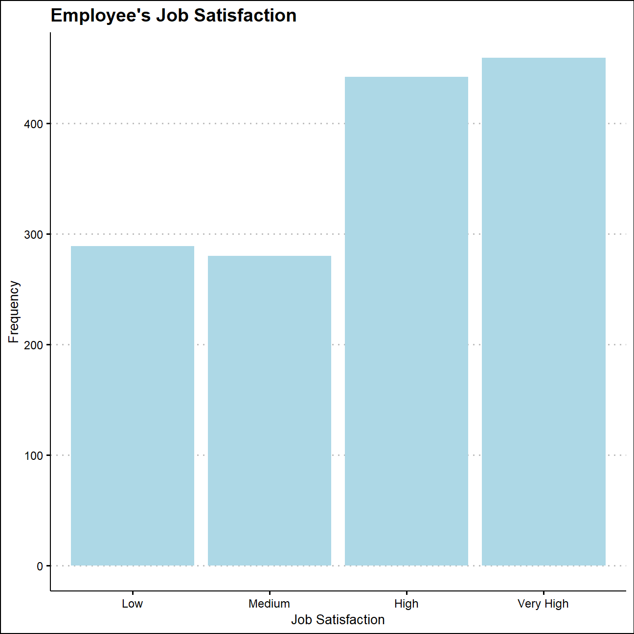
w_l_balance<- hr_cleaned %>%
  group_by(work_life_balance) %>%
  count() %>%
  ungroup() %>%
  mutate(pct_work_life_balance = n/sum(n))%>%
  mutate(wl_level=factor(work_life_balance,ordered = TRUE,levels = c("Bad","Good","Better","Best") ))
w_l_balance%>%
  kbl()%>%
kable_styling()| work_life_balance | n | pct_work_life_balance | wl_level |
|---|---|---|---|
| Bad | 80 | 0.054 | Bad |
| Best | 153 | 0.104 | Best |
| Better | 893 | 0.607 | Better |
| Good | 344 | 0.234 | Good |
ggplot(w_l_balance,aes(x=wl_level,y=n))+
  geom_col(fill="light blue")+
  labs(title = "Employees' Work-Life Balance",
       x="Work-life Balance",
       y="Frequency")+
  theme_clean()+
  NULL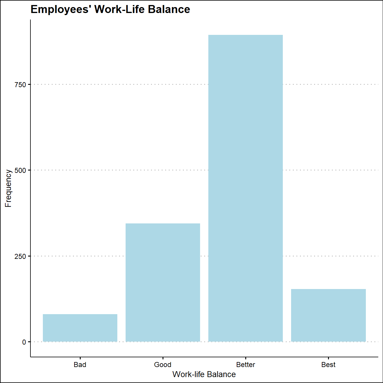
According to the tables and graphs above, over 60% of the 1470 employees are highly satisfied with their job, there are still 19.7% of employees who reported low job satisfaction. Meanwhile, over 70% of the employees regarded their work_life balance as better than “Good”, and 10% of employees have assessed their work-life balance as “Best”.
Besides,the number of people who have low job satisfaction are much bigger than those who have bad work-life balance, which suggests that other variables apart from work-life balance may be the main reason that lead to low job satisfaction.
Is there any relationship between monthly income and education? Monthly income and gender?
Let’s take a look at the distribution of monthly income in different educational levels.
hr_dataset %>%
  select(Education, MonthlyIncome) %>%
  cor()
## Education MonthlyIncome
## Education 1.000 0.095
## MonthlyIncome 0.095 1.000mi_edu<-hr_cleaned%>%
group_by(education)%>%
summarise(average_income=mean(monthly_income),std_income=sd(monthly_income),min_income=min(monthly_income),max_income=max(monthly_income))
mi_edu%>%
kbl()%>%
kable_styling()| education | average_income | std_income | min_income | max_income |
|---|---|---|---|---|
| Bachelor | 6517 | 4817 | 1081 | 19926 |
| Below College | 5641 | 4484 | 1009 | 19973 |
| College | 6227 | 4525 | 1051 | 19613 |
| Doctor | 8278 | 5061 | 2127 | 19586 |
| Master | 6832 | 4657 | 1359 | 19999 |
edu_income<- hr_cleaned%>%
  mutate(edu_level=factor(education,ordered = TRUE,levels = c("Below College","College","Bachelor","Master","Doctor")))

ggplot(edu_income,aes(x=edu_level,y=monthly_income,color=education))+
  geom_boxplot(fill="light blue", color="blue")+
  labs(title = "Monthly Income Spread",
       subtitle="in different education levels",
       x="Education Level",
       y="Monthly Income")+
  theme_clean()+
  theme(legend.position="none")+
  NULL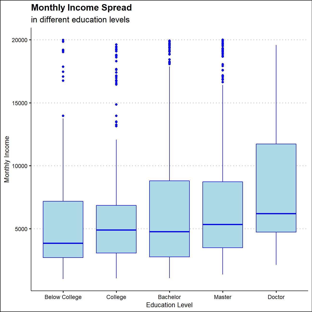
The correlation between education level and monthly income is 0.095, which shows that the 2 variable are positively correlated. However, this correlation is also close to zero, so let’s check the income distribution across different education levels.
The average monthly income moves up as the years of education goes up, which means those who with higher educational level may have a higher income level in general. And The variance becomes greater as the education level increases as well. Meanwhile, each group has some people whose monthly income is more than 15000, which means that the educational background would not bring certain ceiling in their income.
Now let’s look at the monthly income distribution in different gender groups.
mi_gender<-hr_cleaned%>%
  group_by(gender)%>%
  summarise(average_income=mean(monthly_income),std_income=sd(monthly_income),min_income=min(monthly_income),max_income=max(monthly_income))
mi_gender%>%
  kbl()%>%
kable_styling()| gender | average_income | std_income | min_income | max_income |
|---|---|---|---|---|
| Female | 6687 | 4696 | 1129 | 19973 |
| Male | 6381 | 4715 | 1009 | 19999 |
ggplot(hr_cleaned,aes(x=gender,y=monthly_income,color=gender))+
  geom_boxplot(fill="light blue", color="blue")+
  labs(title = "Monthly Income Spread",
       subtitle="in gender groups",
       x="Gender",
       y="Monthly Income")+
  theme_clean()+
  theme(legend.position="none")+
  NULL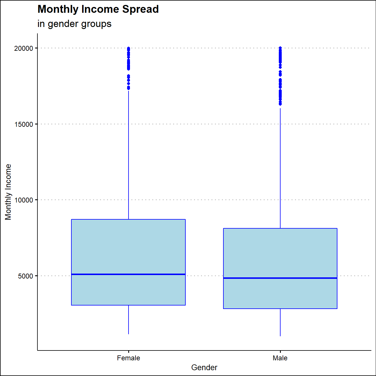
The overall distribution is quite similar between gender groups. The average monthly payment of female employees is 6687, which is 300 more than that of male employees. What’s more, the variance of monthly income in male group are higher than that in female group.
Monthly Income Distribution in Different Job Roles
hr_cleaned%>%
  group_by(job_role)%>%
  arrange(monthly_income)
## # A tibble: 1,470 x 19
## # Groups: job_role [9]
## age attrition daily_rate department distance_from_h~ education gender
## <dbl> <chr> <dbl> <chr> <dbl> <chr> <chr>
## 1 20 Yes 1362 Research ~ 10 Below Co~ Male
## 2 18 No 287 Research ~ 5 College Male
## 3 28 No 1144 Sales 10 Below Co~ Male
## 4 30 Yes 945 Sales 9 Bachelor Male
## 5 29 Yes 746 Sales 24 Bachelor Male
## 6 19 Yes 303 Research ~ 2 Bachelor Male
## 7 25 Yes 599 Sales 24 Below Co~ Male
## 8 31 No 1276 Research ~ 2 Below Co~ Female
## 9 18 No 812 Sales 10 Bachelor Female
## 10 23 No 373 Research ~ 1 College Male
## # ... with 1,460 more rows, and 12 more variables: job_role <chr>,
## # environment_satisfaction <chr>, job_satisfaction <chr>,
## # marital_status <chr>, monthly_income <dbl>, num_companies_worked <dbl>,
## # percent_salary_hike <dbl>, performance_rating <chr>,
## # total_working_years <dbl>, work_life_balance <chr>, years_at_company <dbl>,
## # years_since_last_promotion <dbl>ggplot(hr_cleaned,aes(x=reorder(job_role,-monthly_income),y=monthly_income))+
geom_boxplot(fill="light blue", color="blue")+
labs(title = "Monthly Income Distribution",
subtitle="in different job roles",
x="Job Role",
y="Monthly Income")+
theme_clean()+
theme(axis.text.x = element_text(angle=45,hjust=1,vjust=1))+
NULL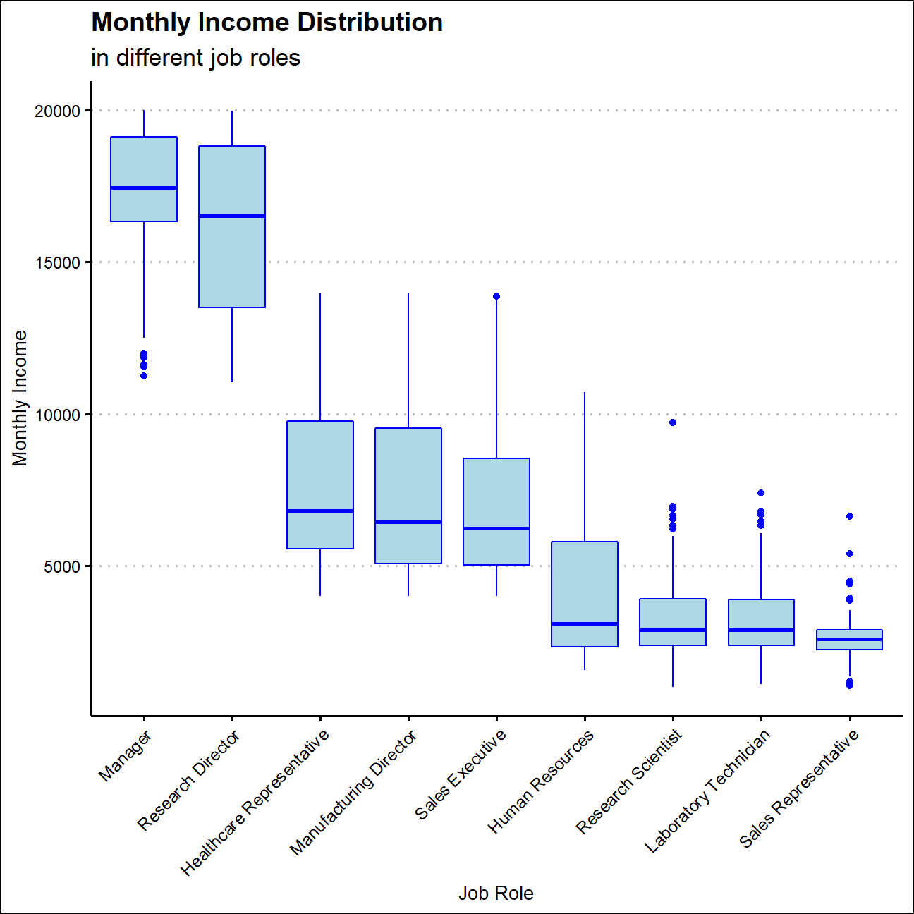
The average monthly income of managers and research directors are more than 15000, which is more than 3 times of research scientists’, laboratory technicians’ and sales representatives’ average income. Meanwhile, income has a right skewed distribution job roles apart from manager and research director.
Calculate and plot a bar chart of the mean income by education level.
mean_income<-hr_cleaned%>%
  group_by(education)%>%
  summarise(average_income=mean(monthly_income))%>%
  mutate(edu_level=factor(education,ordered = TRUE,levels = c("Below College","College","Bachelor","Master","Doctor")))

mean_income%>%
  kbl()%>%
kable_styling()| education | average_income | edu_level |
|---|---|---|
| Bachelor | 6517 | Bachelor |
| Below College | 5641 | Below College |
| College | 6227 | College |
| Doctor | 8278 | Doctor |
| Master | 6832 | Master |
ggplot(mean_income,aes(x=edu_level,y=average_income))+
  geom_col(fill="light blue")+
  labs(title = "Average Monthly Income in Different Education Level",
       x="Education Level",
       y="Monthly Income")+
  theme_clean()+
  NULL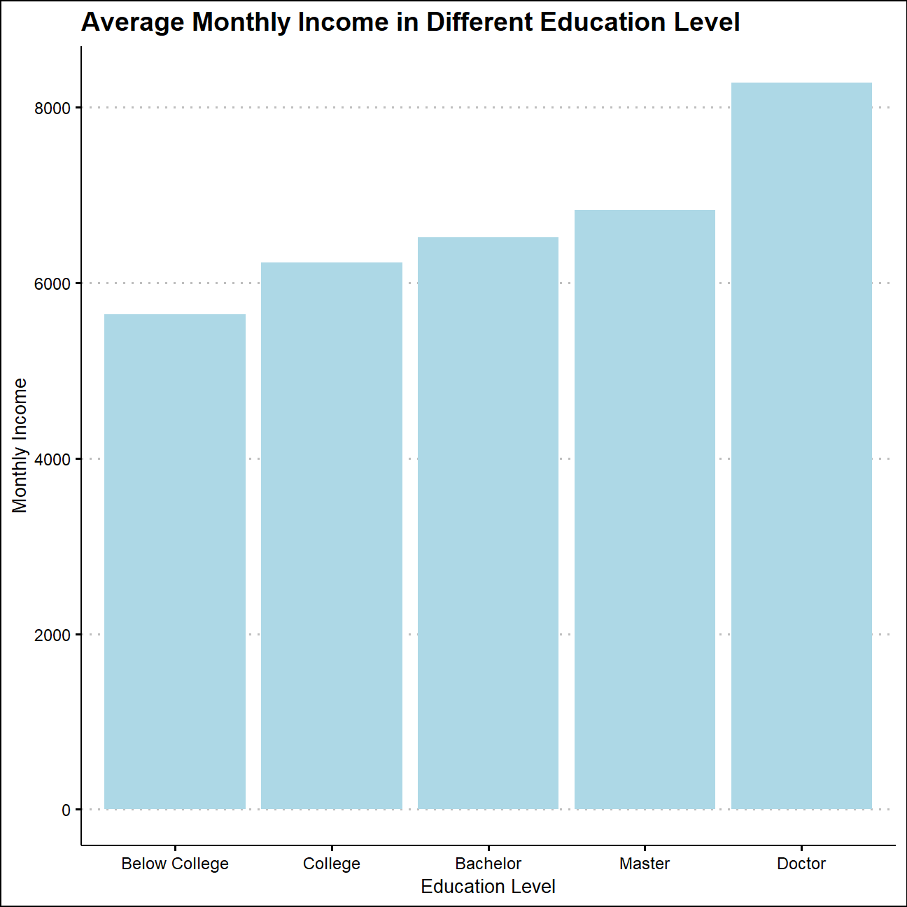
Monthly Income in Different Education Levels
ggplot(edu_income,aes(x=monthly_income))+
  geom_density(fill="light blue", color="blue")+
  facet_wrap(~edu_level)+
  labs(title = "Monthly Income Distributions",
       subtitle="in different education levels",
       x="Monthly Income",
       y="Density")+
  theme_clean()+
  NULL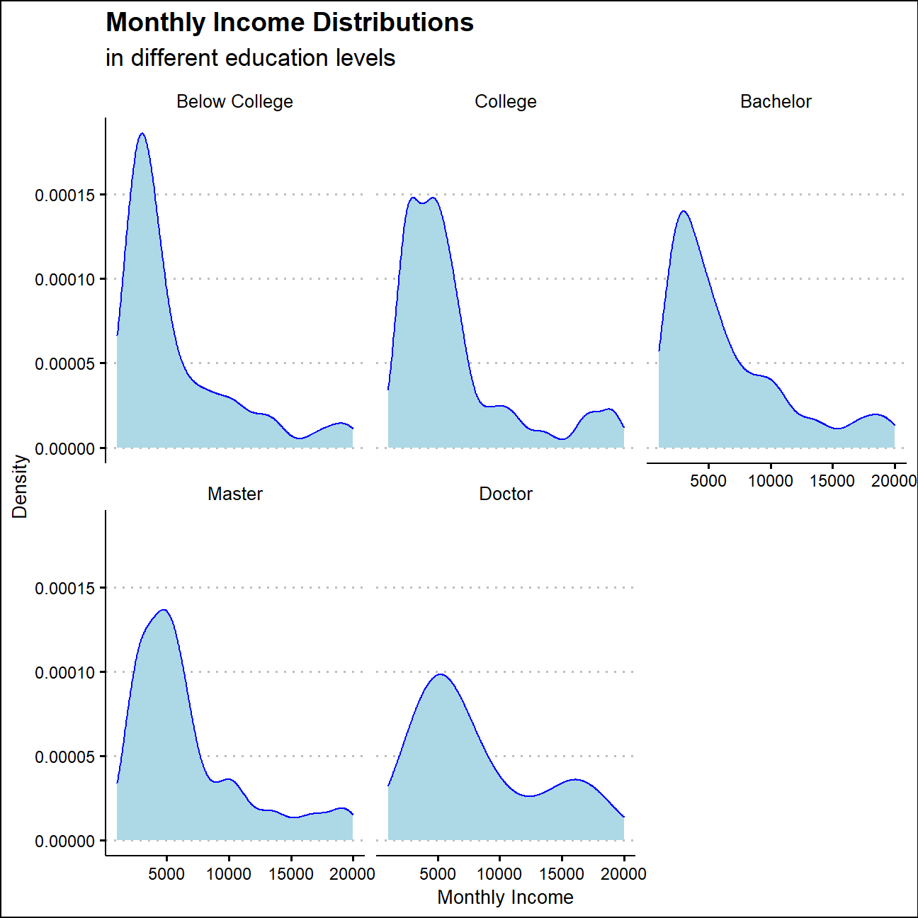
The right tail of income distribution becomes fatter as the education level increases, which also supports the positive correlation between monthly income and education level.
Monthly Income Distribution in Ages
ggplot(hr_cleaned,aes(x=age, y=monthly_income,color=age))+
  geom_col(fill="light blue")+
  facet_wrap(~reorder(job_role,-monthly_income))+
  labs(title = "Monthly Income Distribution in Ages",
       subtitle="across job roles",
       x="Age",
       y="Monthly Income")+
  theme_clean()+
  theme(legend.position="none")+
  NULL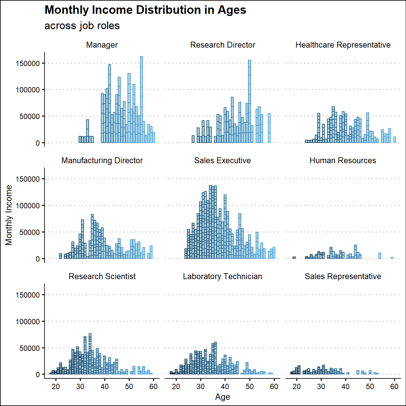
Employees’ monthly income usually increases with age and and comes to the peak between their thirties to forties. While in senior roles such as managers and research directors, this peak usually appears around their fifties.
The spread of monthly income varies a lot among different job roles as well.Typically, sales executives and manager have wider spread of income than that of HRs and sales representatives.